Multi-card checkout for a greeting card marketplace
A card is a small way of saying "I thought of you", and it only works if it arrives on the right day. At Thortful, people often sent several at once, each to someone different, at a different home and on a different day. I redesigned the basket and checkout so they could get every card right, without having to worry.



Context
The startup
Thortful is a greeting card marketplace. Independent creators design the cards, and customers buy them. Thortful prints each card and posts it straight to the person it is for. In one order you can send one card or twenty, each to a different home and on a different day.
When I joined, Thortful was a new startup, and like any new startup, it wasn't well known yet. We had no reviews and no reputation, so one bad experience with the app or the website could really hurt us. It was something we couldn't afford. Then Customer Support started getting emails from new customers. They had chosen their cards and reached the basket, but when it came to adding addresses, they got stuck. They couldn't work out how to send different cards to different people on different days. The numbers told the same story. Many people filled their basket, then left before paying. The very thing people came to Thortful for was exactly where they got stuck.
Goal
The priority
In any e-commerce product, the basket and checkout matter more than any other part of the journey. They have to work perfectly. If something goes wrong there, people don't buy, and they probably won't come back, because they stop trusting you. So fixing our basket and checkout became our top priority, and it couldn't wait. I led the work, from the first research to the final design.
The brief
Find out exactly where and why people were getting stuck. Then redesign the basket and checkout so that any order, from one card to twenty, feels simple and clear.
Research
How we found out
We moved fast and went straight to our customers to understand what was going wrong.
- User interviews. We talked to customers about how they ordered their cards, and what got in the way.
- User tests. We sat with customers in the office, recorded them sending cards, and watched where they got stuck.
- Customer Support. We worked closely with the team, who kept hearing from confused customers.
- Basket and checkout data. Showed the exact steps where people gave up.
What we found
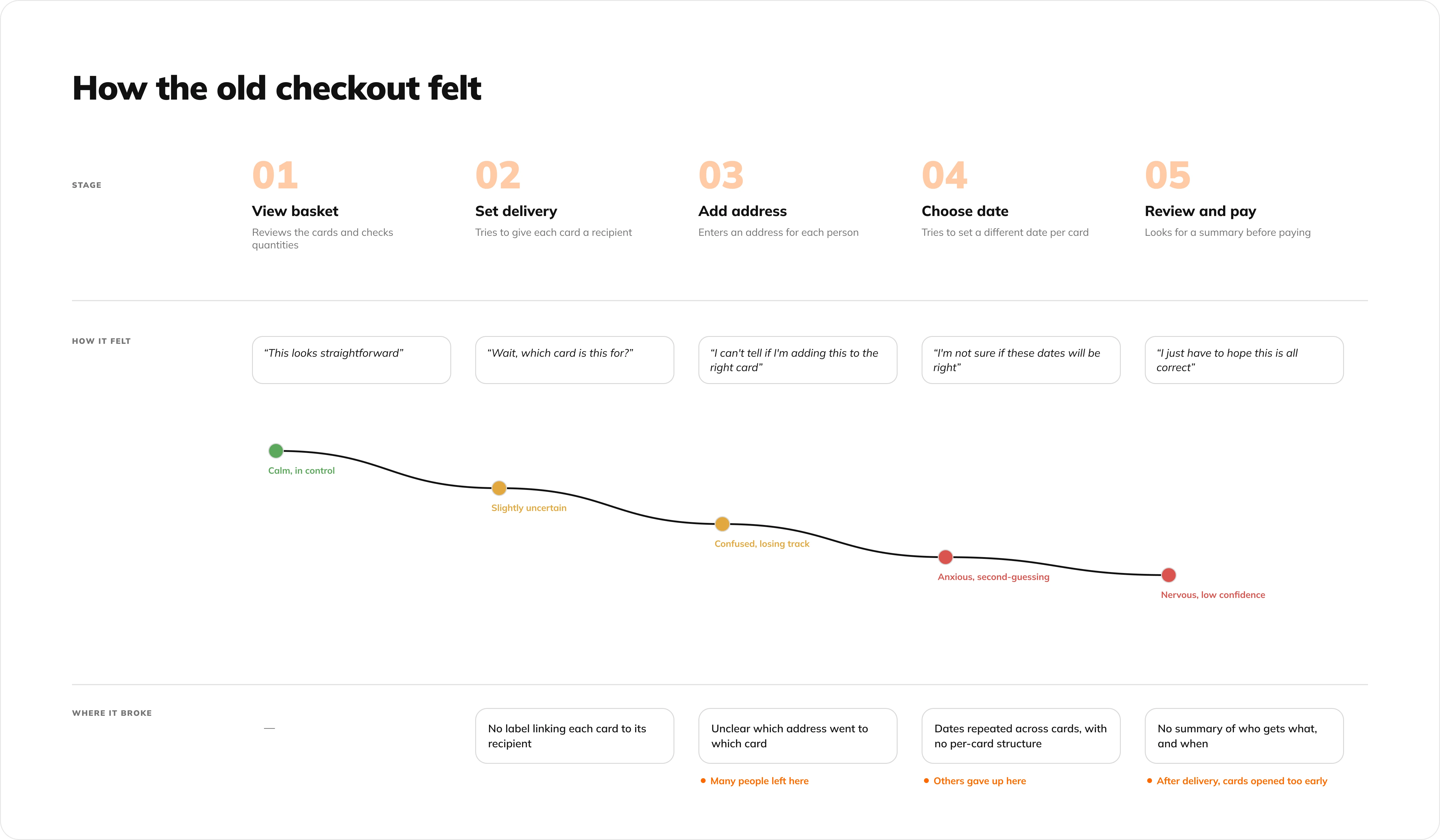
Three problems came up, and each one shaped a decision.
Everything at once
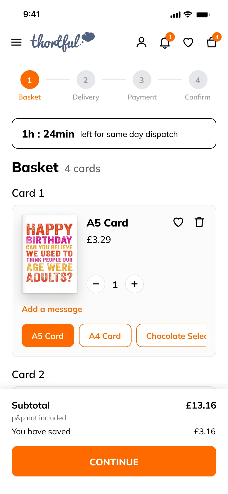
People got stuck when they had to send several cards to several addresses. Everything was on the same level, all at once, so it was hard to know what to do with each card.
Lost halfway
Others got halfway and stopped. They couldn't tell which cards were done and which weren't, or which card was going to which person. "I kept losing track of which card was going to which person. Once you have more than two or three, it gets really confusing."
Mixing up the two dates
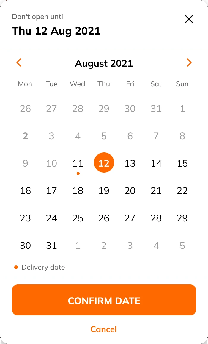
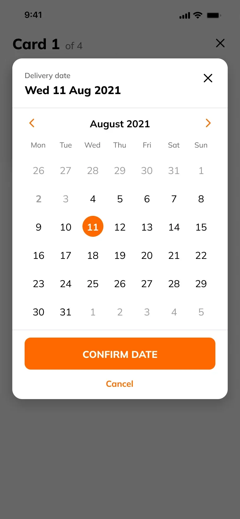
People could choose when a card would arrive, and add a "Don't open until" label for the big day. A birthday card might arrive on 23 July, with a label saying "Don't open until 25 July". But people often forgot the label, set the wrong date, or used the delivery date instead. So some cards were opened too early. "I noticed a 'Don't open until' option but wasn't sure what it did or when I was supposed to use it."
What customers wanted
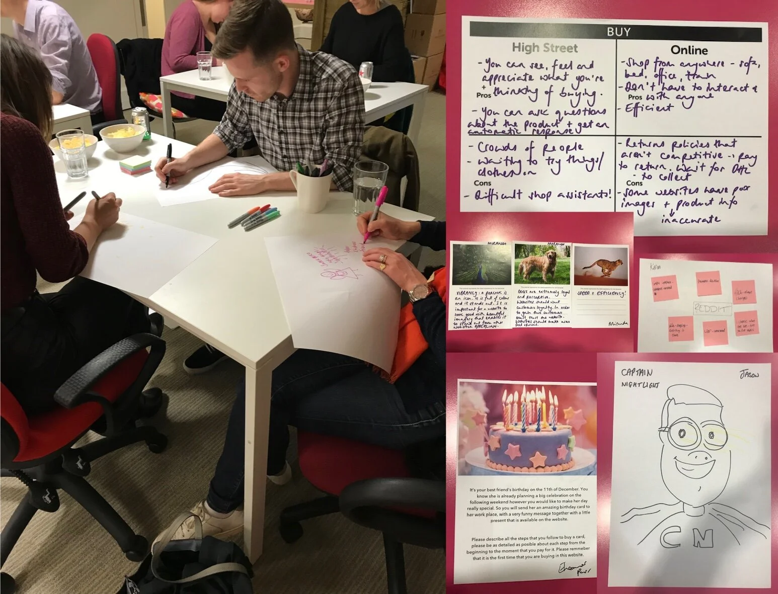
Next, I wanted to know what a perfect basket and checkout looked like for our customers. So I ran co-design workshops and more interviews, where they showed us how they would design it themselves.
The user story
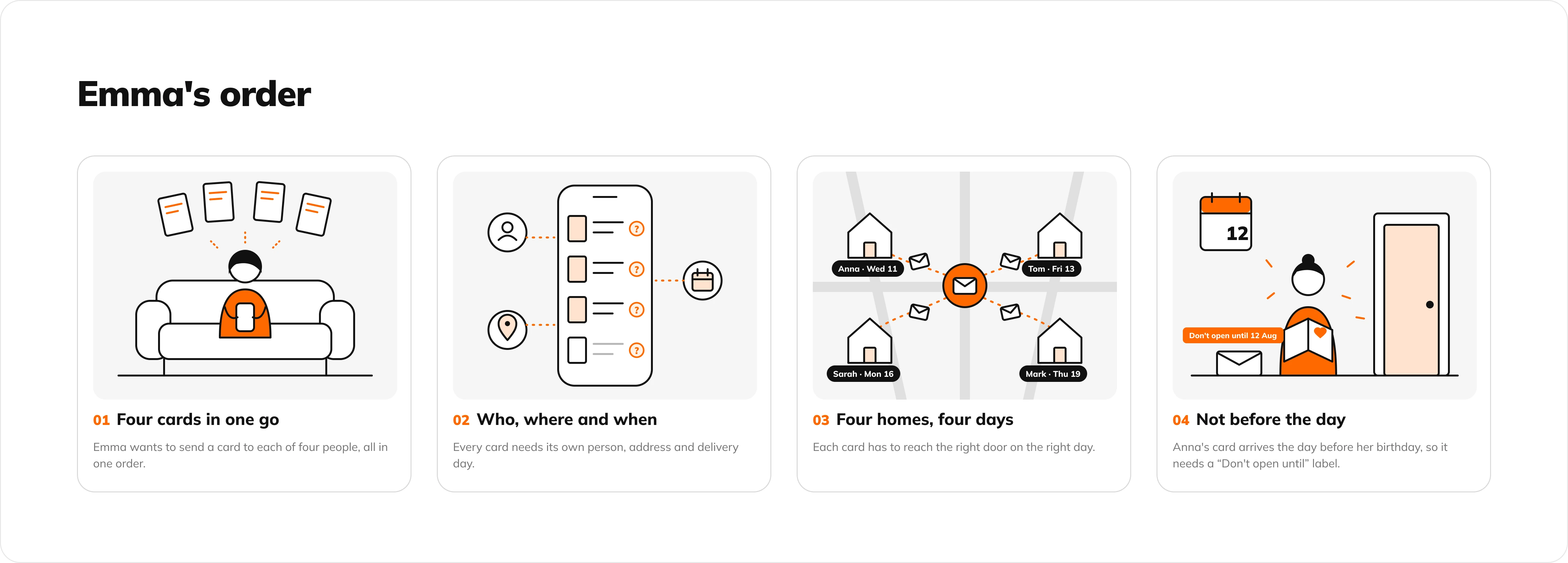
All of this gave us a clear user story. Emma wants to send four cards to four people, each to a different home and on a different day. She doesn't need more options. She needs to feel sure, at every step, that each card is going to the right person on the right day.
Process
Designing for the hardest order first
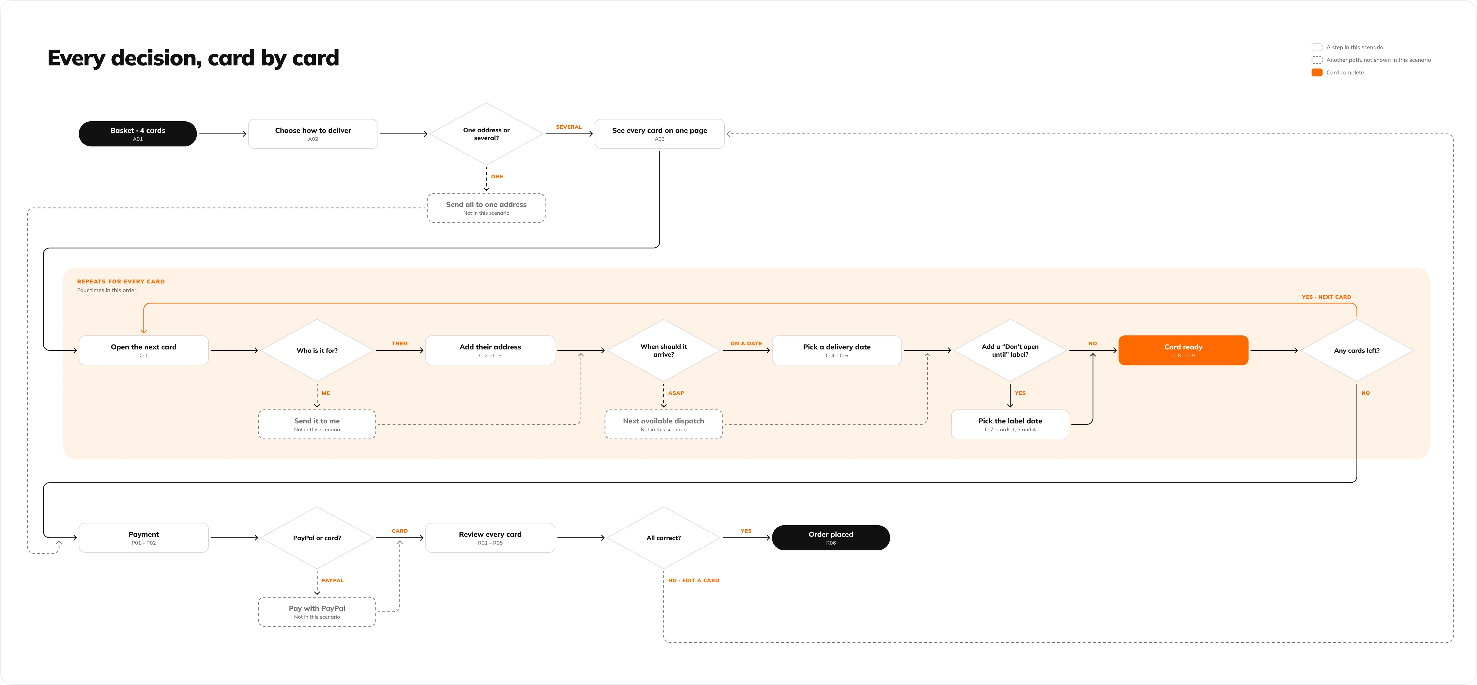
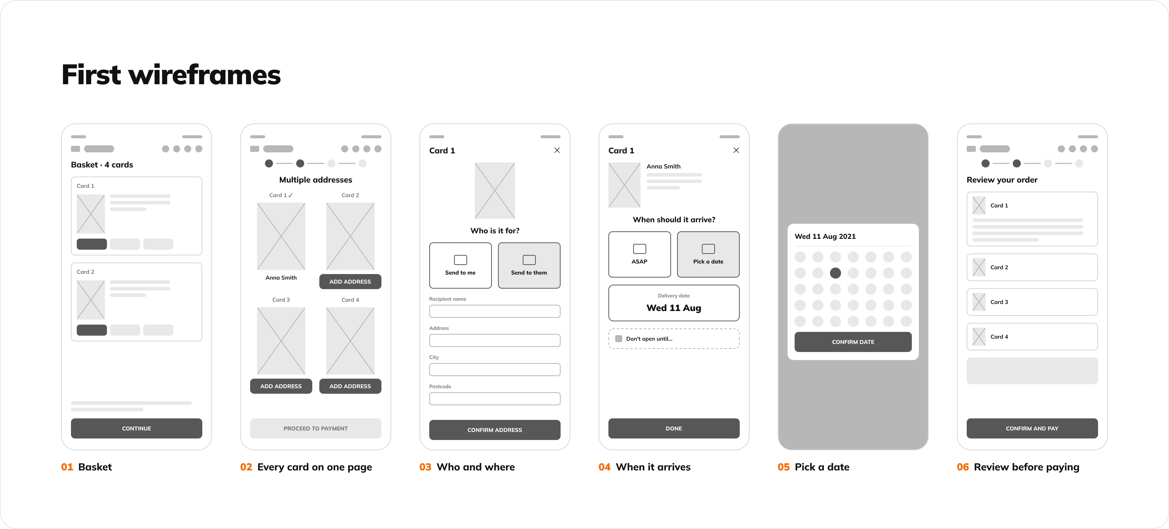
With Emma's user story clear, I started working on the perfect basket and checkout. I began with her order, the hardest one: four cards, to four addresses, on four different days. The same flow also had to work for someone sending just one card. If it worked for Emma's four cards, it would work for one card too.
Flowchart
Solution
The new basket and checkout
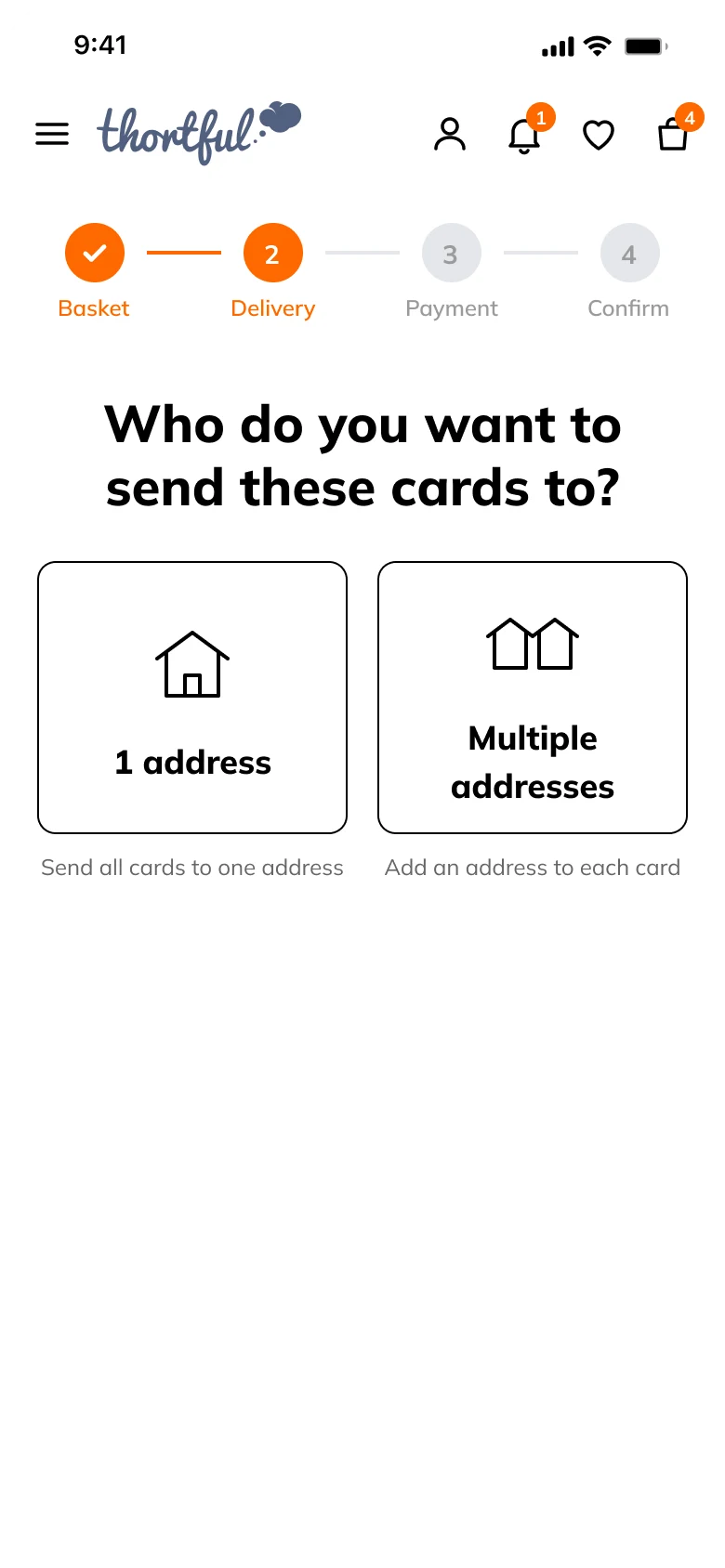
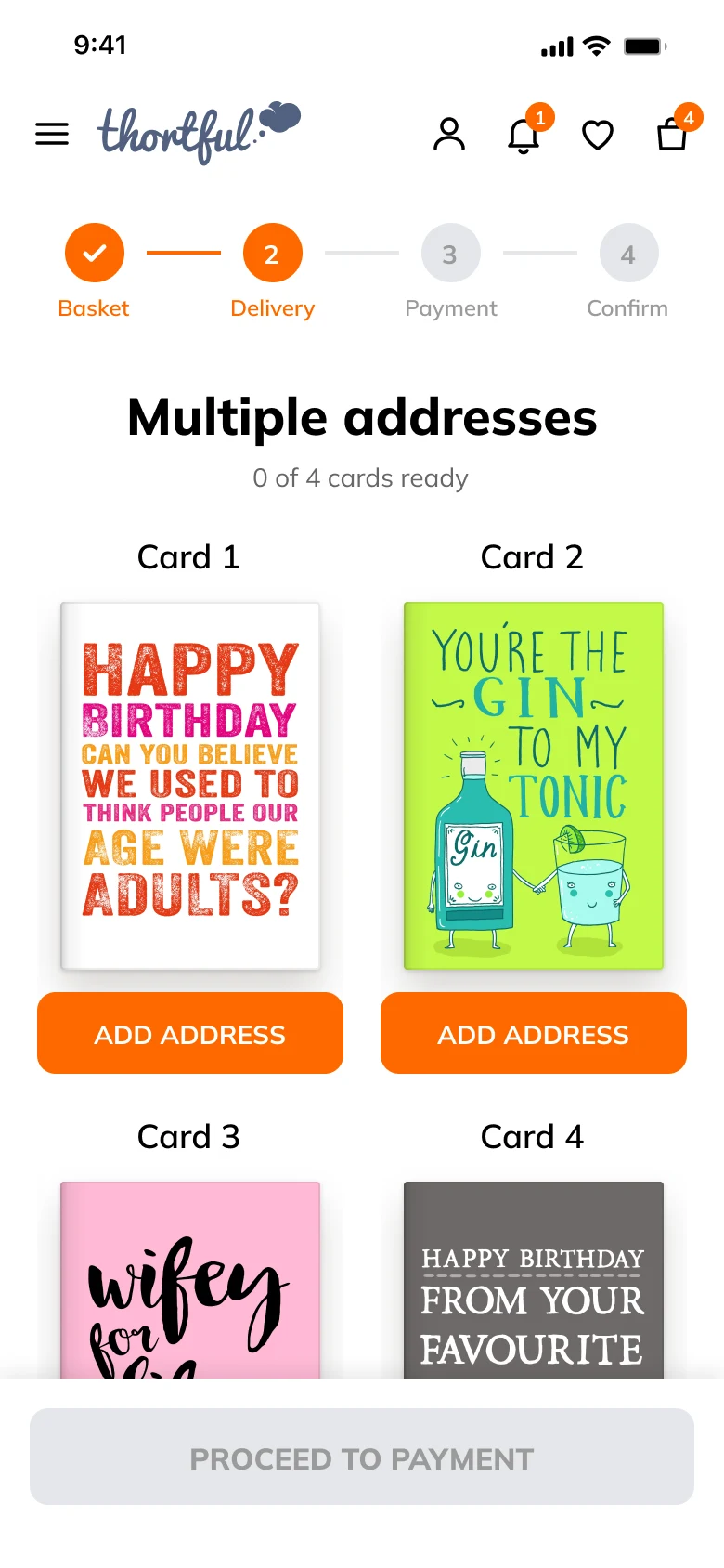
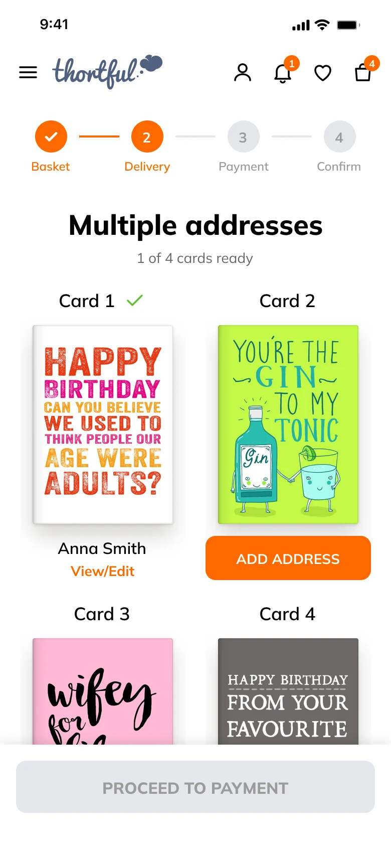
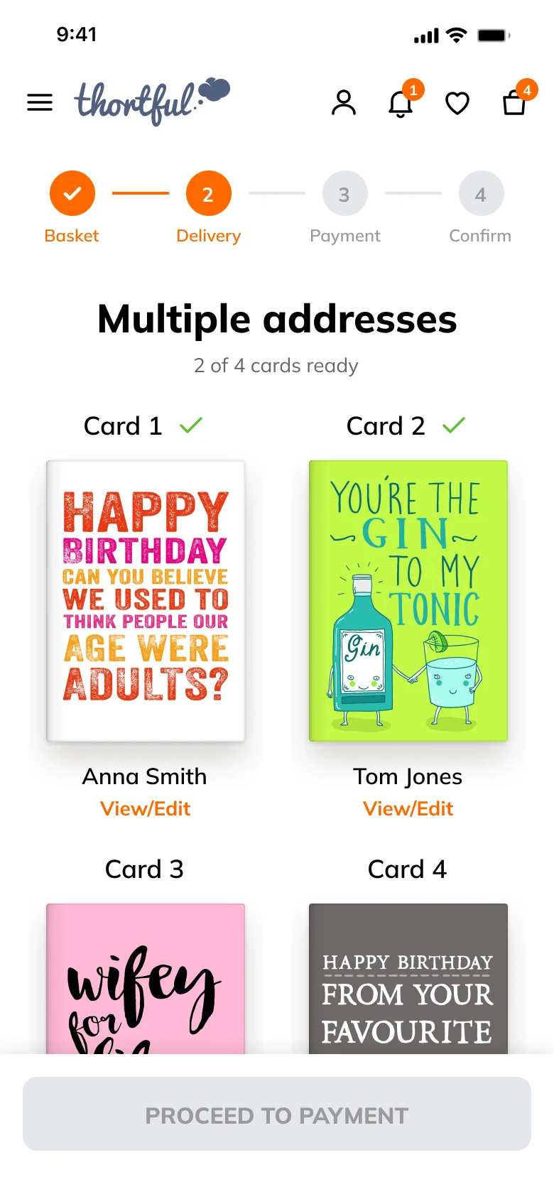
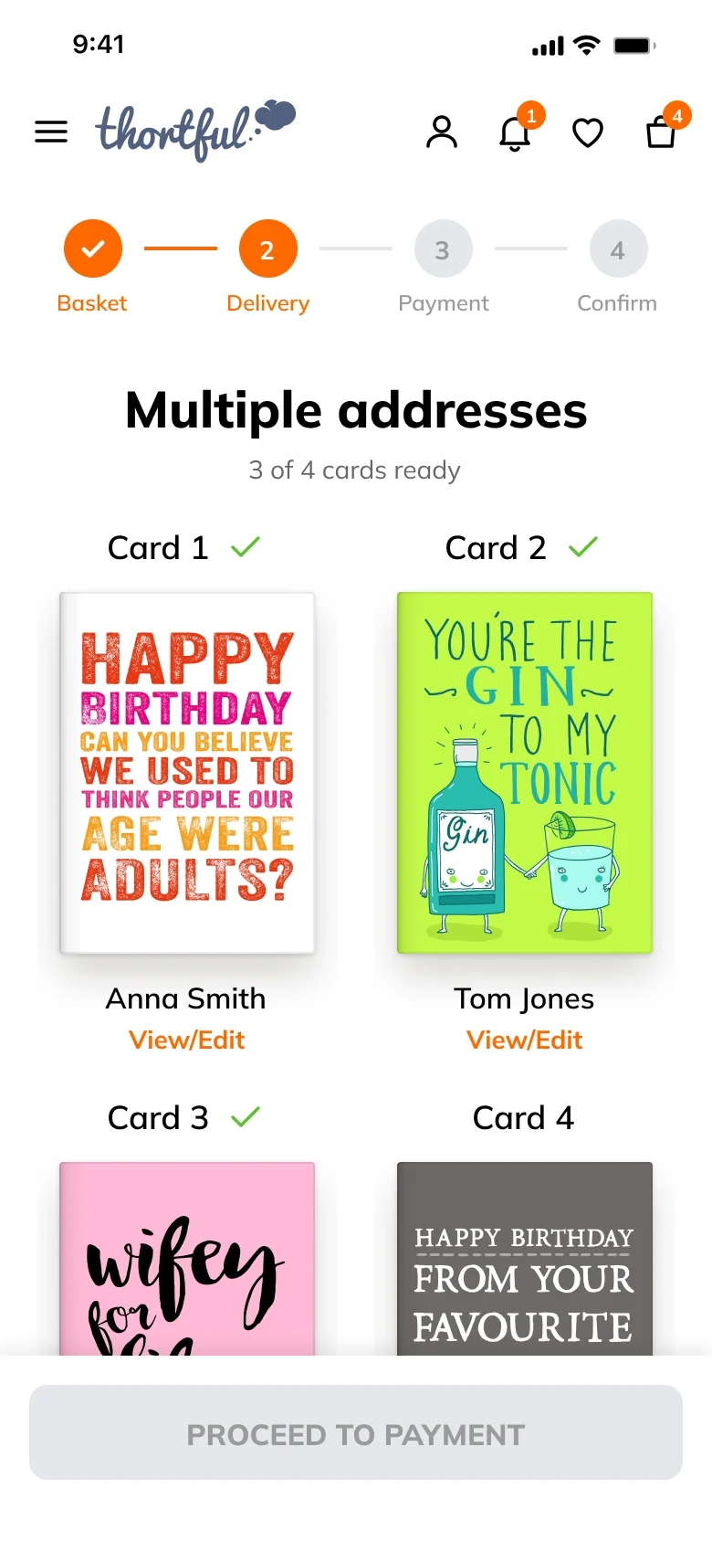
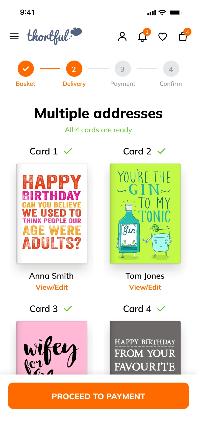
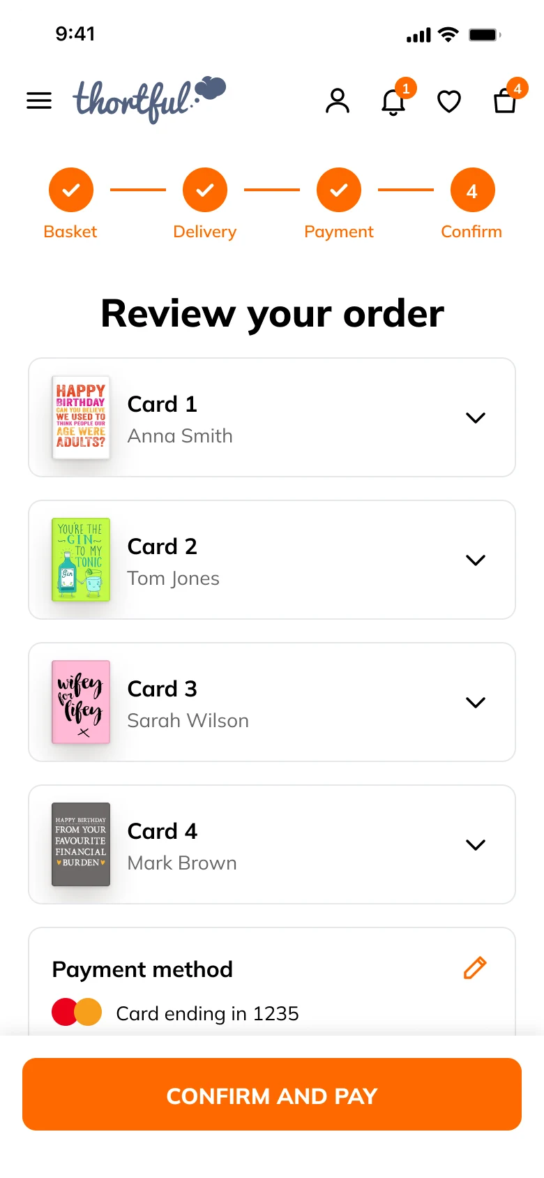
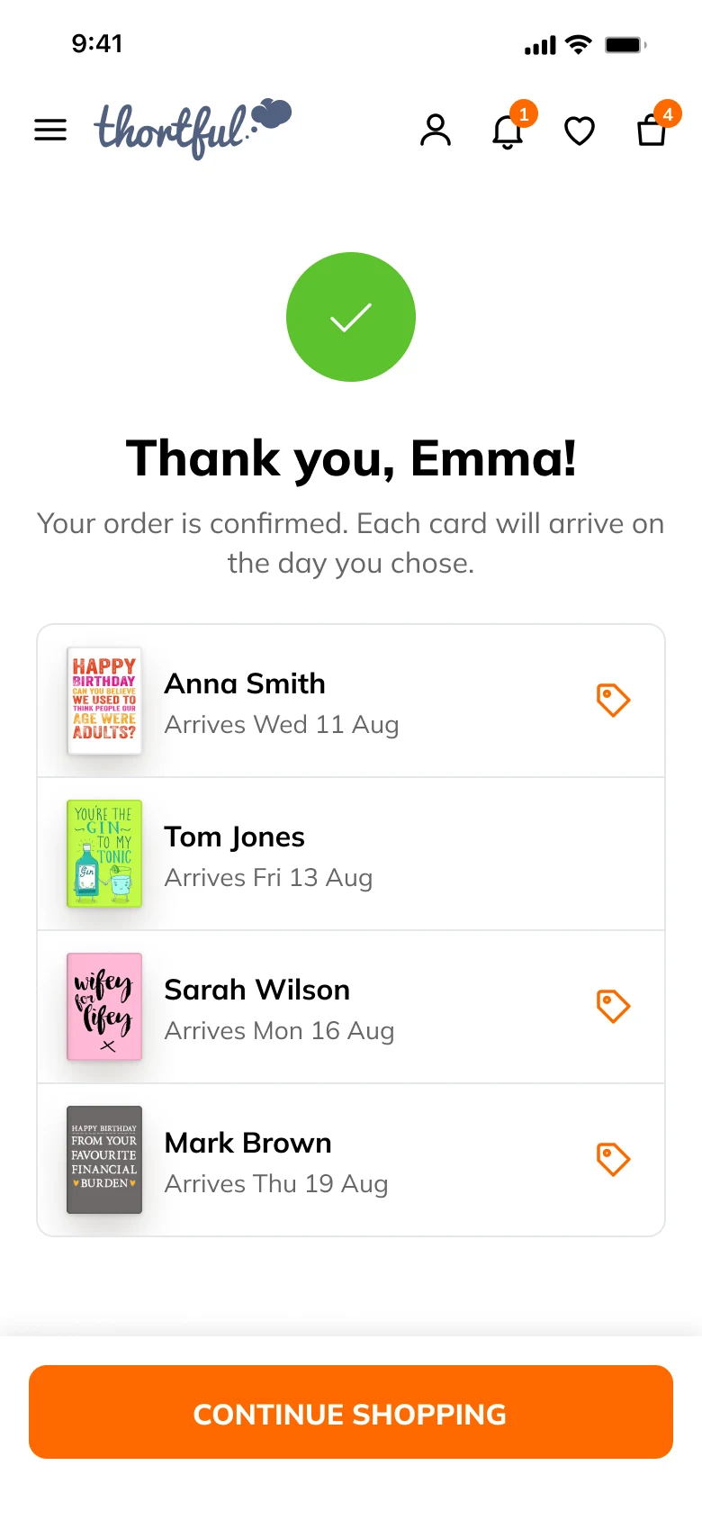
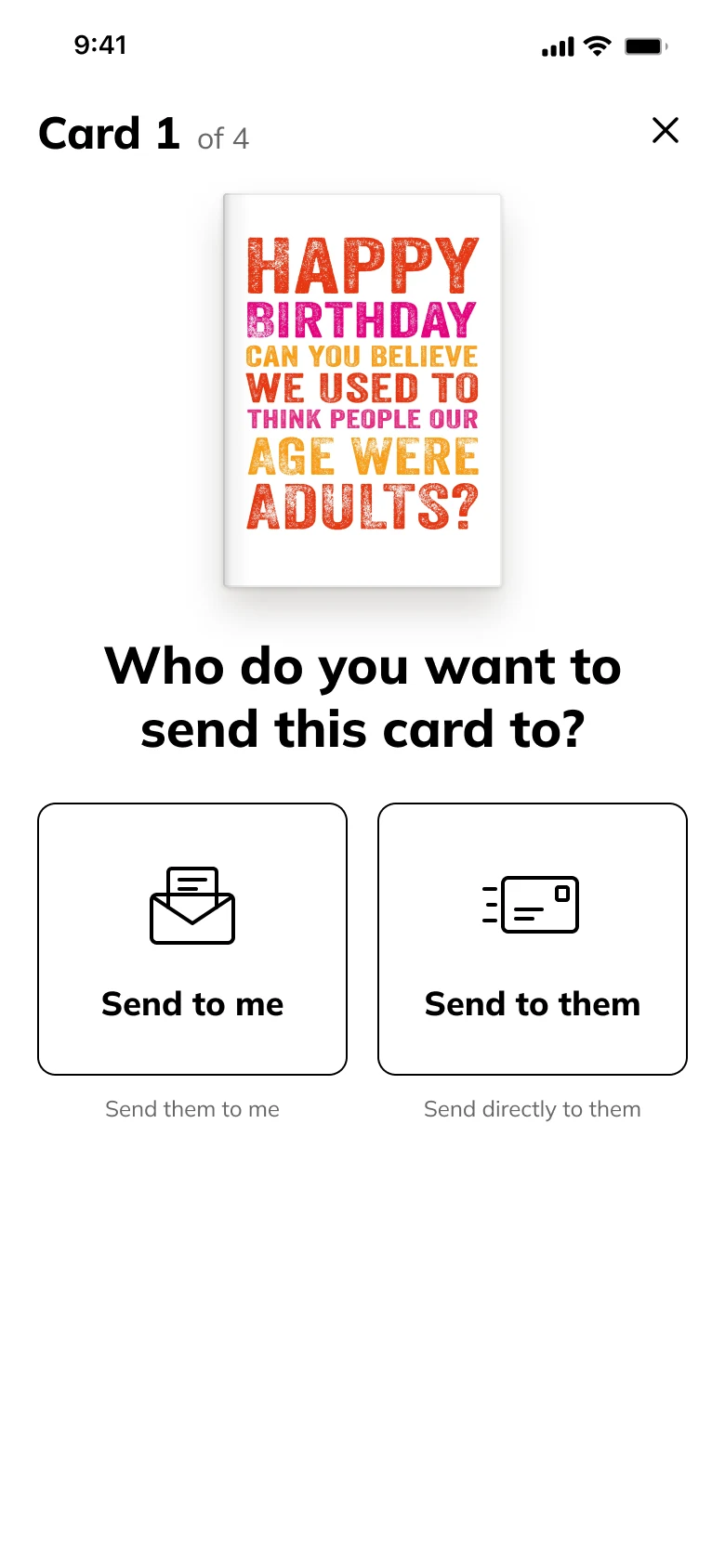
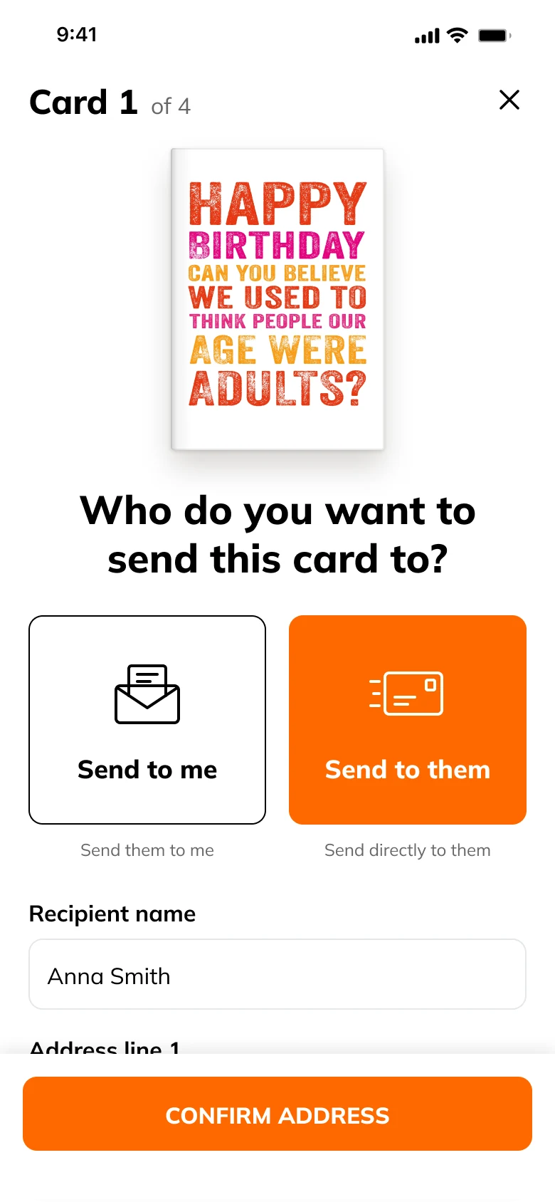
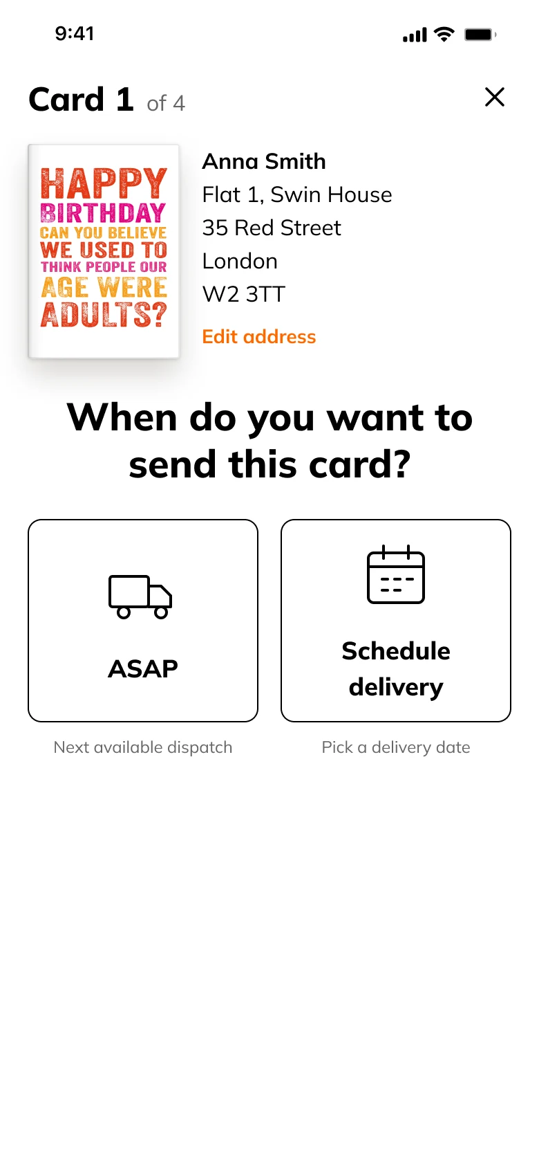
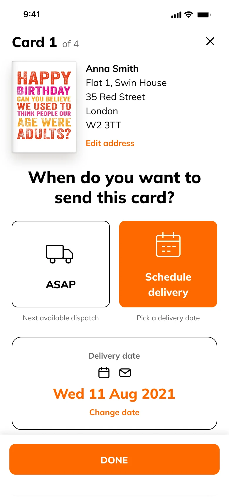
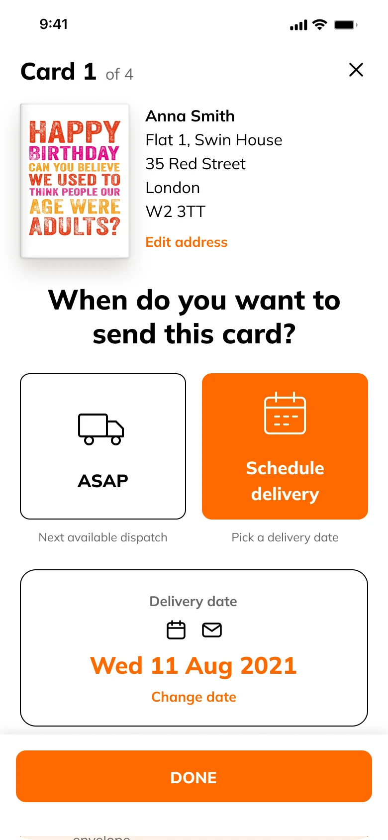
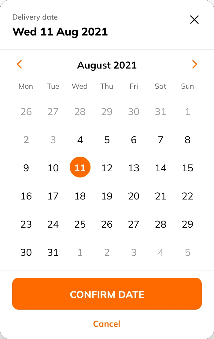
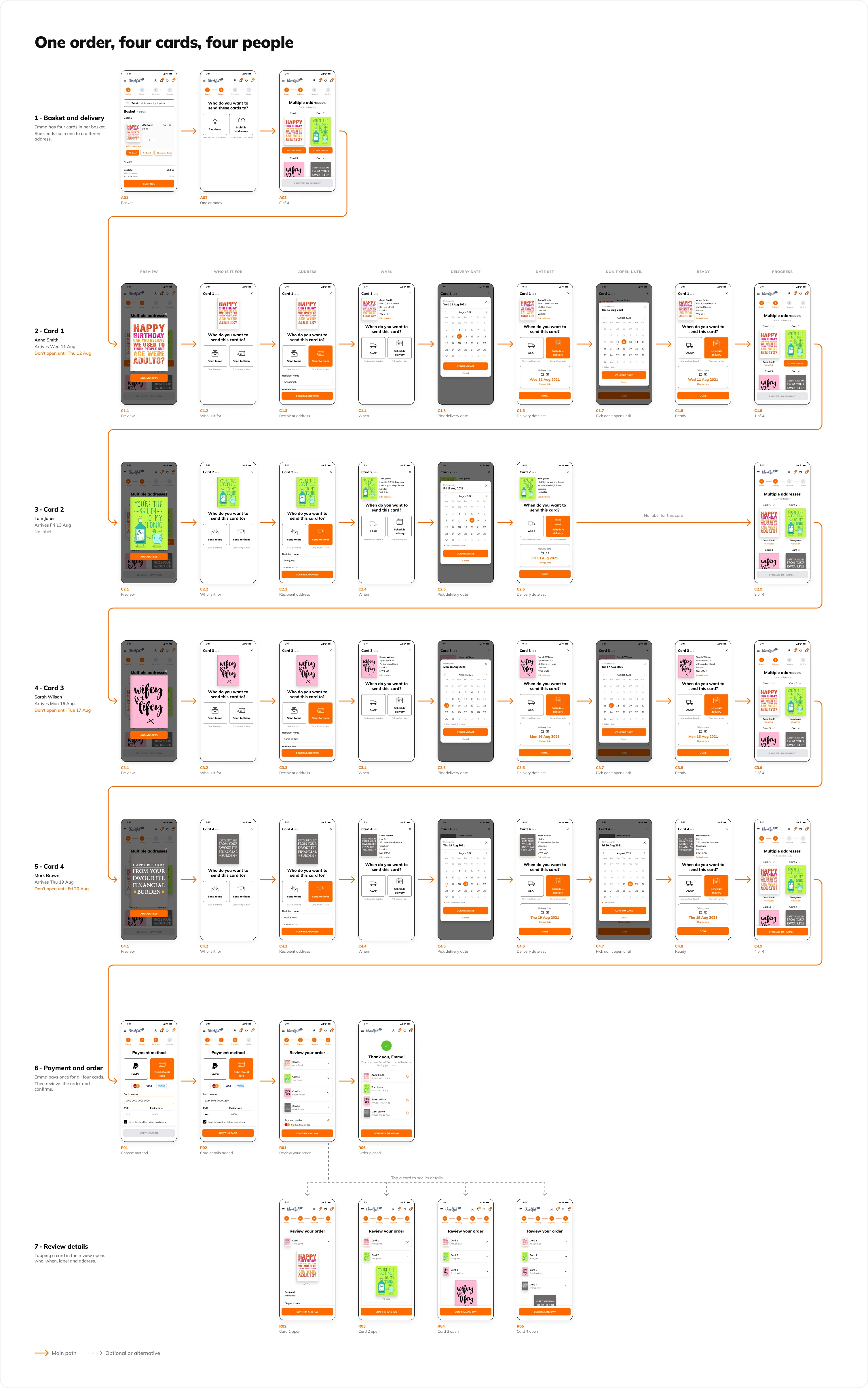
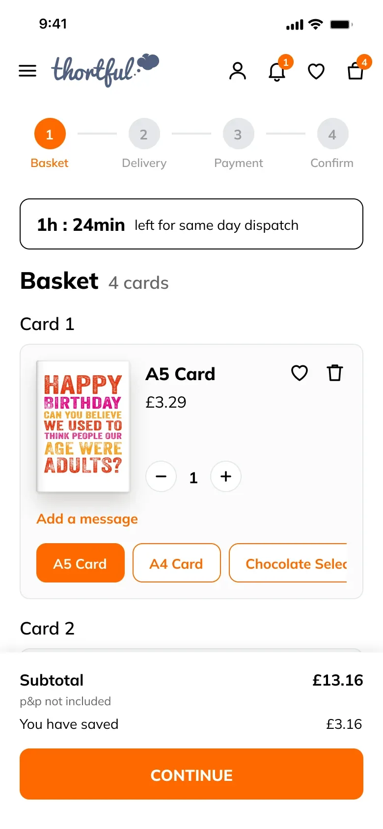
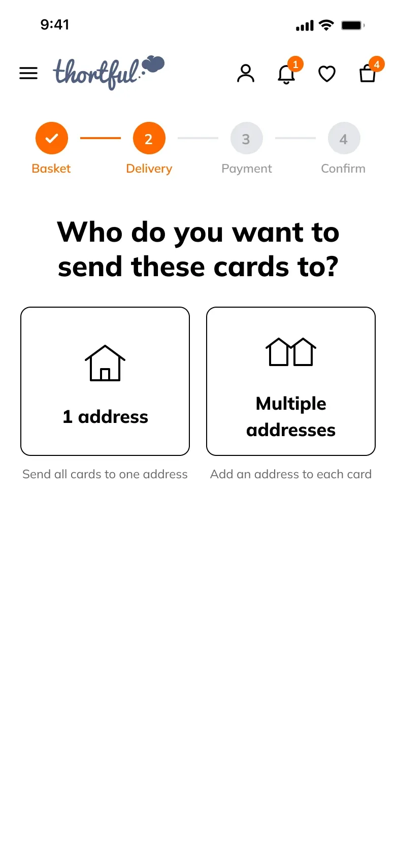
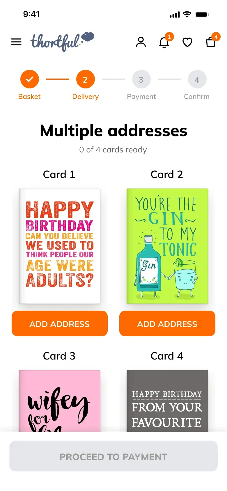
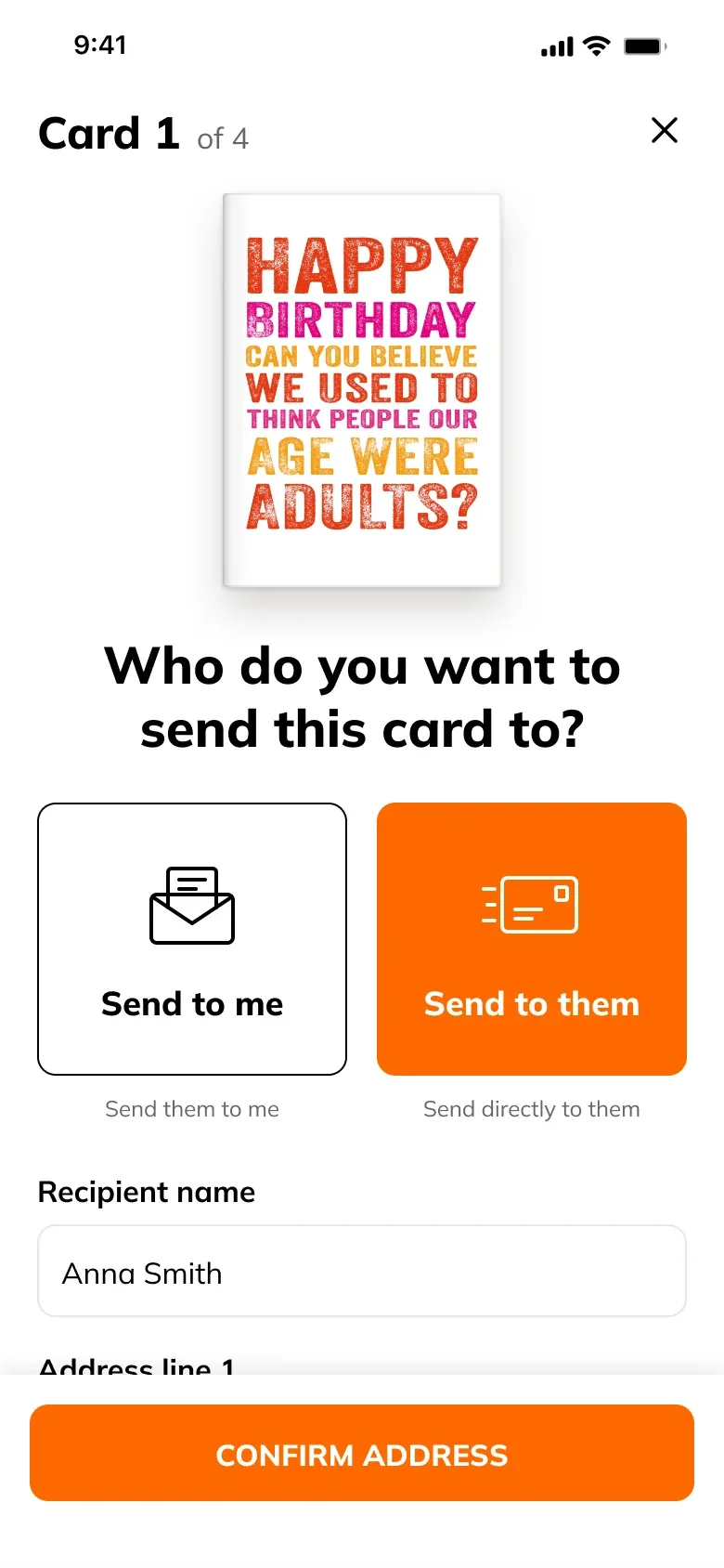
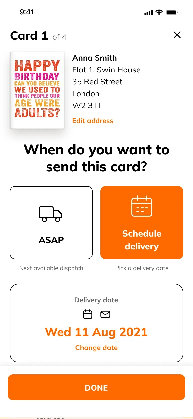
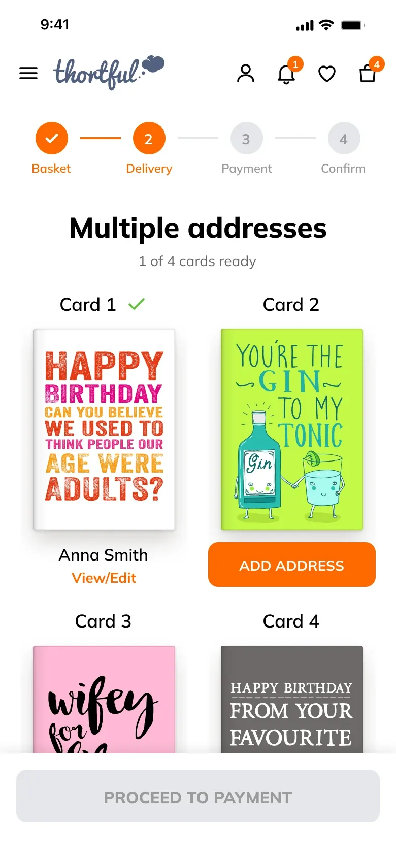
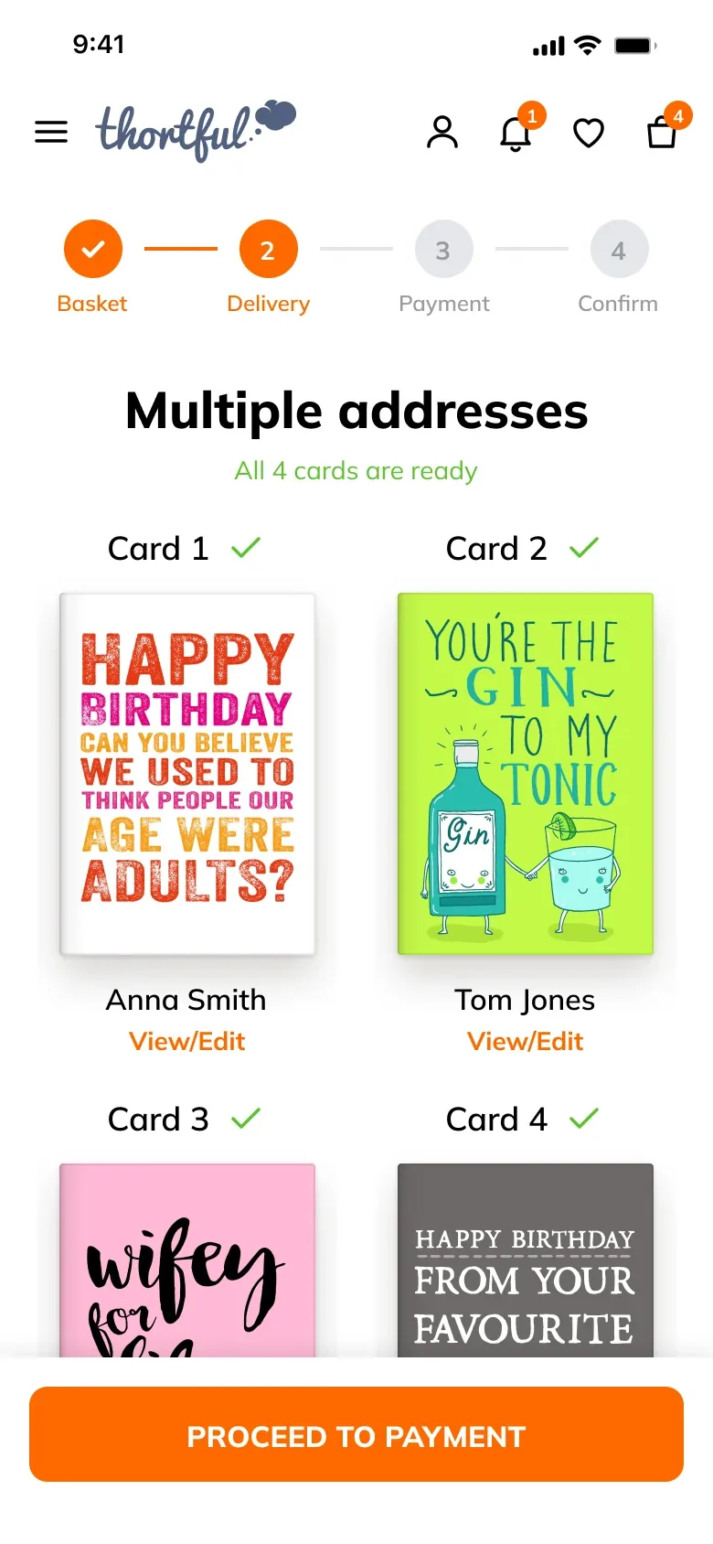
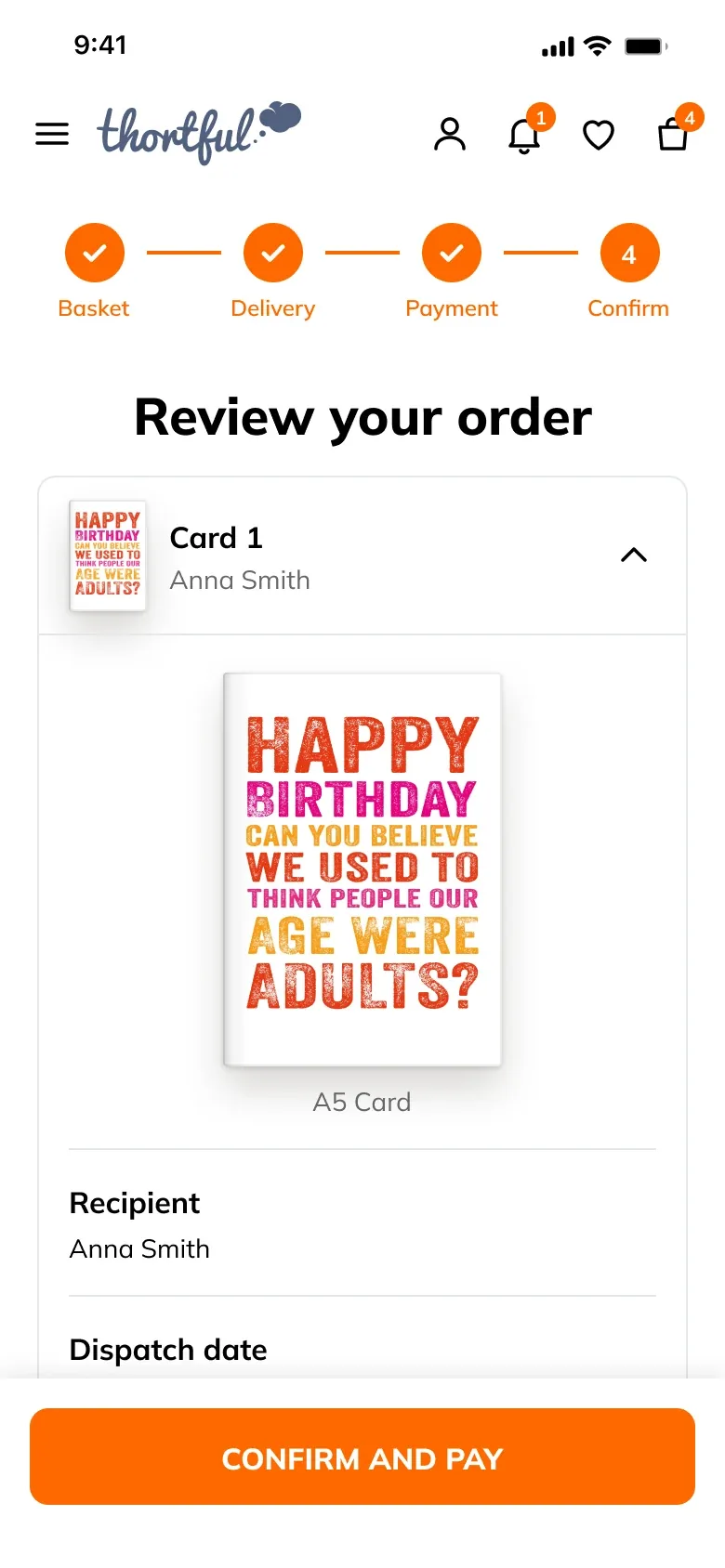
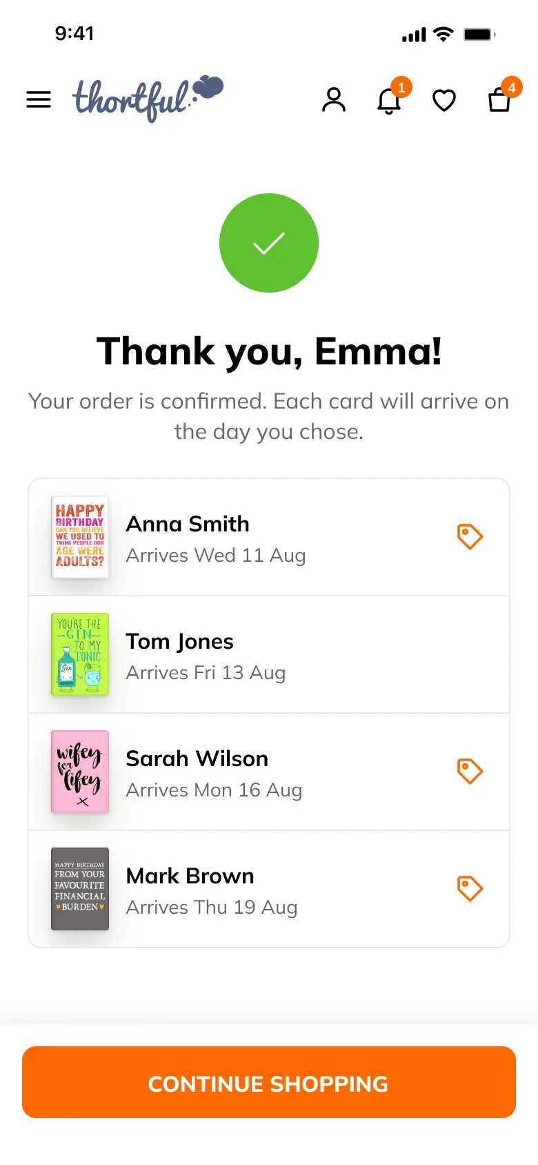
The answer was a clear, simple basket and checkout that showed people where they were at every step, and let them buy their cards quickly. Emma's user story was our reference the whole way through. She is sending four cards to four people on four different days, and she sets up her order one card at a time. For each card, she says who it's for, adds the address, picks the day it should arrive and, if she wants, adds a "Don't open until" date. Each finished card is ticked off, so she always knows what's done and what's left. Payment opens once all four are ready, and before paying she can check every card one last time.
A single card follows the same steps, just once: send it to yourself or to them, pick when it should arrive, and that's it. On desktop, each card opens in a window over the page.
The final flow
1 · Basket and delivery
2 · One card at a time
3 · Payment and order
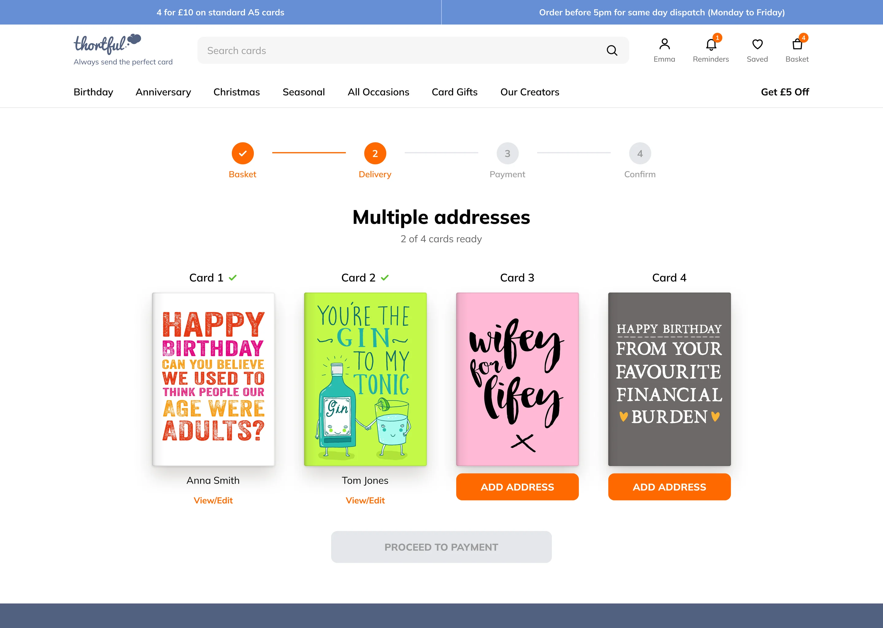
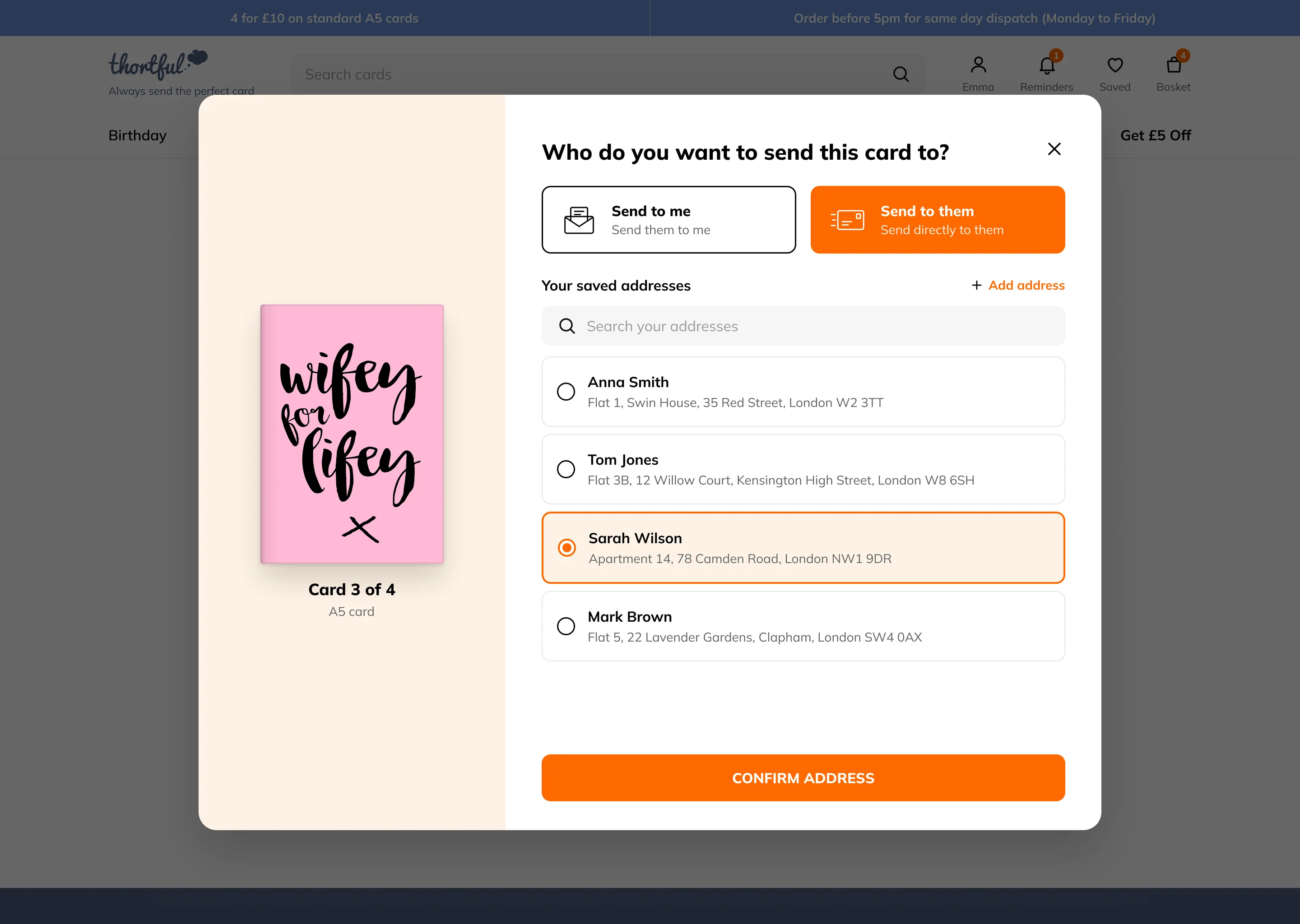
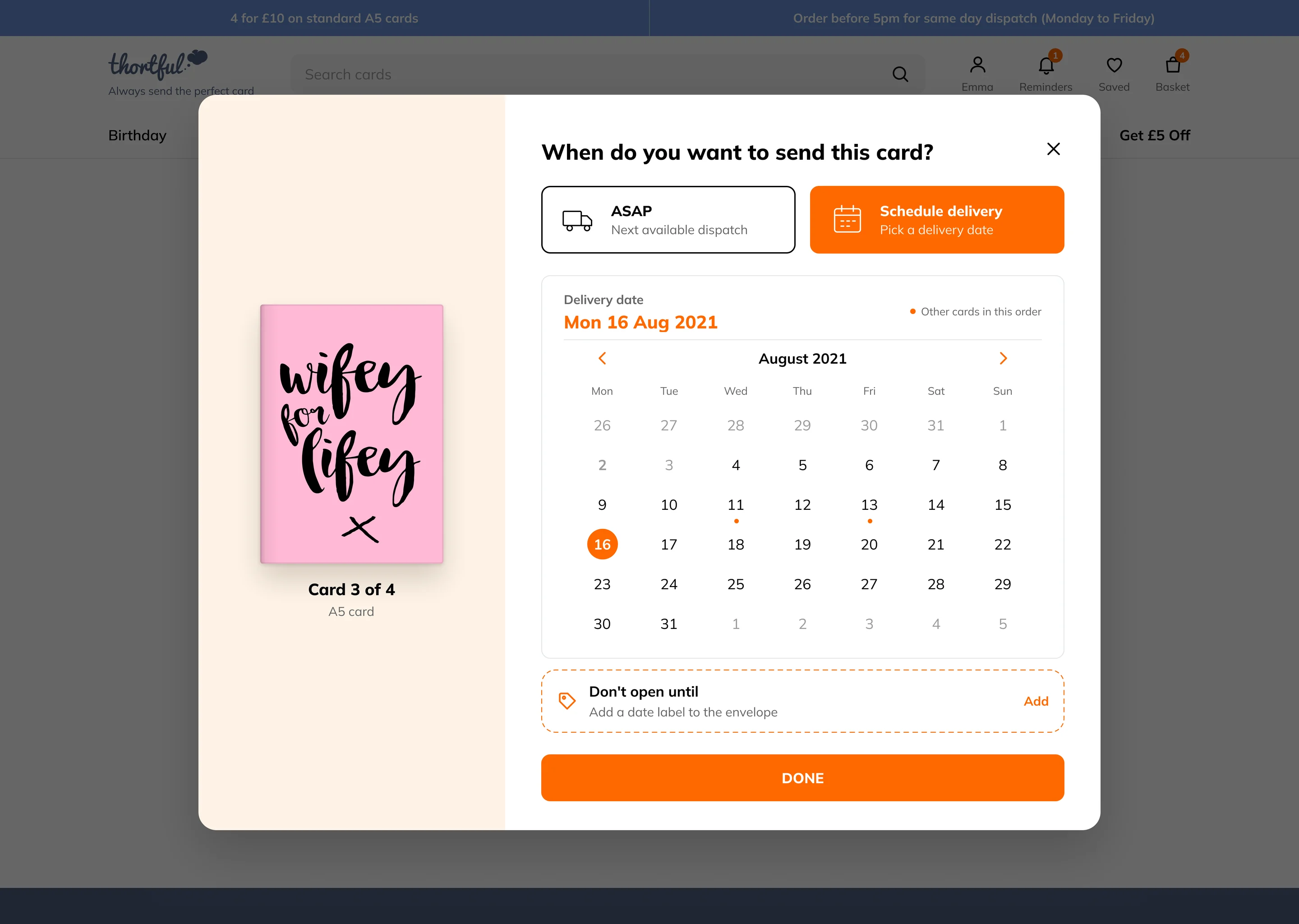
Desktop version
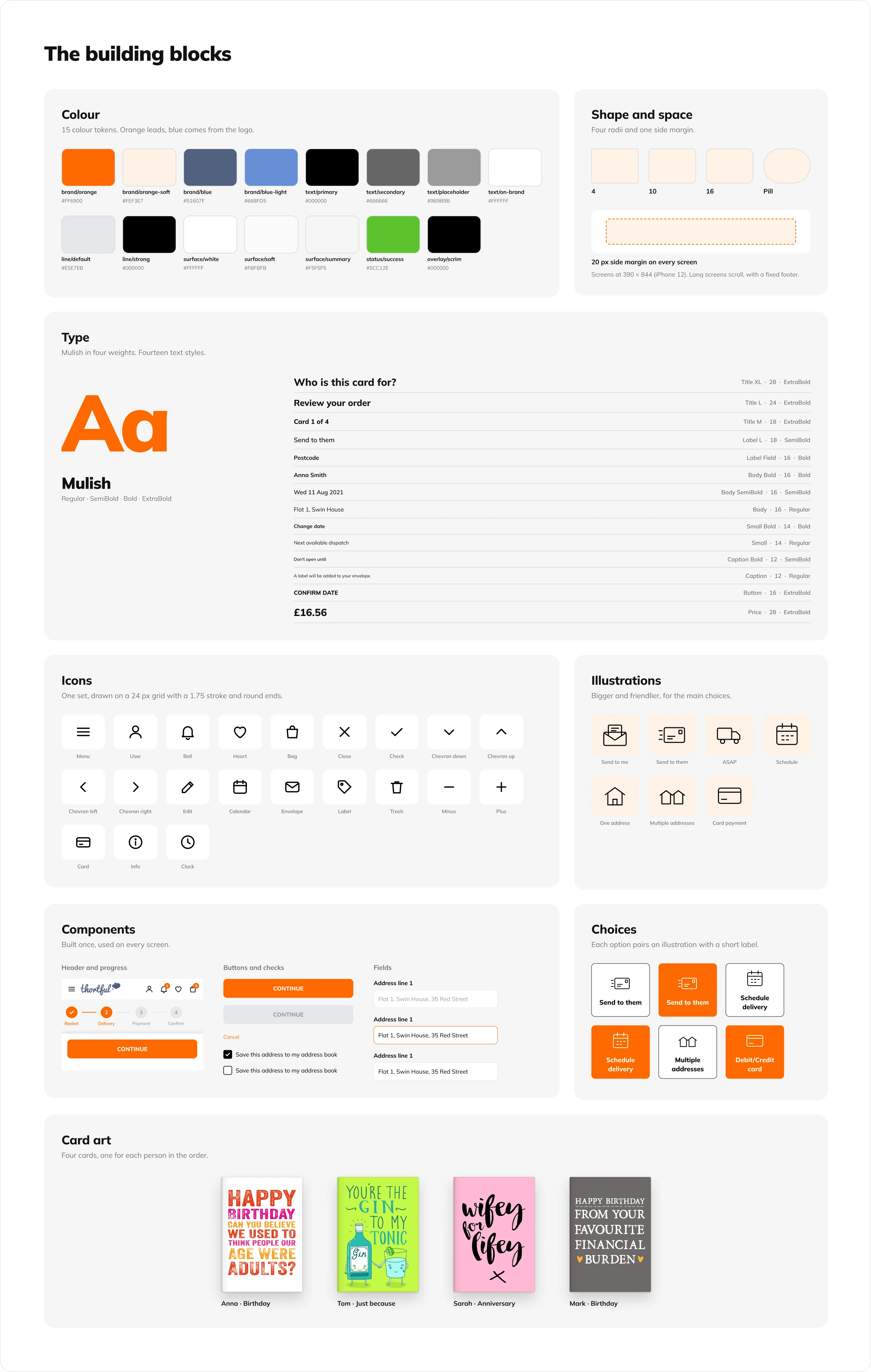
Design system
What each decision cost
Each decision solved one of the three problems, and each one came at a cost.
One card at a time vs fewer screens
When everything was on the same level, people got stuck with several cards and addresses. So each card gets its own short set-up, step by step, and people can always see what to do next. The cost is more screens in a big order: four cards means four set-ups. But each one is short and clear.
The whole order in view vs a shorter path
Others got lost halfway, unsure which cards were done or which card was going to which person. So after each card, people come back to their order, where every finished card is ticked off. The cost is one more step after every card, but they always know what's done and what's left.
The label at the right moment vs one less choice
People mixed up the delivery date and the "Don't open until" date, or forgot the label altogether. So the label appears straight after the delivery day, as its own clear step. The cost is one more choice per card, so I made the label optional.
Impact
What changed
Once it went live, the difference was clear.
Fewer complaints
In the months after the new checkout went live, complaints to Customer Support about orders with several cards dropped sharply.
More orders finished
Checkout conversion rose significantly, and far more people finished checkout without help.
Faster for everyone
We kept only the steps people needed. Returning customers could buy a card and a gift in a few taps, in under a minute.
For a startup that began with no reviews and no reputation, that mattered. Thortful went on to be App of the Day on the App Store two years in a row, with a 4.9 rating.
“Ordering cards for multiple people has never been this simple. Arrived on time, every time.”
“Everything is clear and effortless to use. The app makes the whole process feel quick, simple and stress free.”
“Card sorted and sent in no time.”